Startup Jedi
We talk to startups and investors, you get the value.
Hey! It’s Alexandr Kovalev speaking. I am the founder of the aggregator of freshly roasted coffee producers "STATUS: Coffee" and today I will talk about Power BI, which is one of the BI services, that is, services for processing and visualizing data.

Startup Jedi
We talk to startups and investors, you get the value.
Like many of you, from the very start of our project, we began to keep track of income and expenses in a regular Excel spreadsheet. Until a certain time, this is enough. But my past corporate experience and the habit of visualising all the numbers and indicators forced me to look for a BI service for these purposes pretty quickly.
The search began among the currently popular services for cost accounting: Financier, PlanFact, Seeneco and others.
The advantages of such services are clear:
Ease of entering transactions;
Integration with banks;
Many preset graphs;
Cash gap forecast.
But there are also downsides:
System restrictions (all logic is limited by the functionality of the service);
Prepayment for at least 3 months (I don’t pay for several months in advance).
As a result, I decided to try to apply a service from my corporate past in our project Power BI от Microsoft.
Pros of Power BI:
Cons:
In the end, it may look like this. There is a separate Excel file on sales in the context of orders maintained by the sales department, there are statistics on traffic and advertising channels in Google Analytics and other data of the marketing department, current total costs that are kept by the finance department. In Power BI, all this data can be combined, processing can be configured, and you can have several outputs: a separate output typical for the sales department (sales volume for the period, dynamics, LTV, number of regular customers), marketing (the effectiveness of advertising channels, Cost per Click for each of them ) or for the business owner and investors (P&L, balance sheet, NSV).
In addition to data visualization itself, there is another important reason to use Power BI — the presence of a reporting system in the project, which increases the investment attractiveness of the project. Power BI allows you to generate a special type of report for the investor (with only data intended for them) in almost real time.
...
At first glance, the word “Microsoft” may scare you away since the service must be expensive, and in part it is. But there is also a free option, which is quite enough.
We register at https://powerbi.microsoft.com/en-us/get-started/ with a corporate e-mail (if you have a website, you can make an email for it for free, and most likely you already have it).
Next, there are two options for working — cloud and desktop. The cloud one is a little faster in scanning, but the desktop one is more functional, convenient and understandable (imo). I recommend to download and install it (it’s free): https://powerbi.microsoft.com/en-us/desktop/
...
Power BI has a huge number of data visualization options (tables, graphs, KPIs, “speedometer”, numbers and columns on a geographic map, Gantt, all of which are available in the free version of the service). The application also allows you to create custom control systems (buttons for switching between tabs, sliders, and others). Check out some other features below:
Merging and processing tables.
All data is synchronized: we click on the column of one chart, all the rest are rebuilt for this parameter (for example, year).
My favorite: a free app where you can see the same reports with graphs and numbers as in the desktop or cloud version. You can give access to certain reports, for example, to your investor, and they will always be aware of what is happening. It even works on Apple Watch.
You can highlight part of the screen for discussion with a pencil and leave comments and other functions for team interaction.
Set a signal for an event (for example, changing the value of a certain parameter by n%).
For a report, you can get a script and upload it on the site — this is an easy and quick way to share metrics with the public. It will also be interactive on the site.
...
A simple practical example. Let’s say you have a table with orders that has many columns (date, item, quantity, price, customer first and last name, etc.) and a table with costs (date, cost item, amount, invoice, etc.).
What’s next?
The Power BI desktop version is structured in three parts:
Report where reports are configured.
Data where you can add measurements for tables and formulas.
Model where connections between tables are configured.
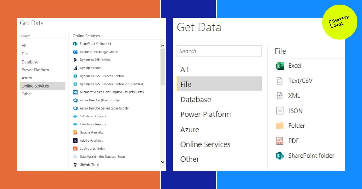
First, we connect Power BI to data sources. As I wrote above, Power BI can connect to completely different sources, ranging from simple Excel tables to cloud databases:

Select the Excel data source and specify the path to the file (in the example, the Sales table).
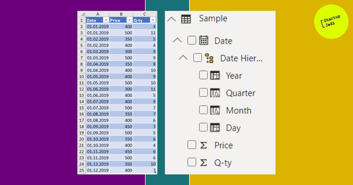
After that, the simple example table will be decomposed in Power BI by measurements, and dates will also be decomposed by hierarchy (day, month, quarter, year):

At this stage, you can already build a simple table, graph or KPI block and put data there:

Of course, Excel can build a simple graph as well. But, as I wrote above, in Power BI you can combine data from different sources, and then process and display it. Let’s see how to do this, having previously loaded a similar table with costs by days (Expenses).
First, let’s add a column for the first table with the calculation of total revenue. To do this, select the loaded Sales table in the Data section (left side of the screen). Then, on the top panel, click New Column and write the calculation formula for the new column Revenue = [Price] * [Q-ty].

Next, we create the Profit table. One or more key dimensions are needed to collect data. In our case, it is logical to use a column with dates that we can then connect with the rest of the tables.
I’ll create a table the following way:
Click on the top panel Get Data -> Blank Query. The Power Query Editor will open.
In the query that opens in the formula bar, write the formula for joining the loaded tables Table.NestedJoin (Sales, {“Date”}, Expenses, {“Date”}, “Expenses”, JoinKind.Inner) and press Enter. A new table will appear that merges the two loaded ones (Sales and Expenses).

3. Right click on the Date column and select Remove Other Columns. After that, only the column with dates will remain.
4. Right click on the Date column again and choose Remove Duplicates. After that, all duplicated dates will be deleted.
5. Click Close & Apply in the upper left corner, after which the Power Query editor will close, and the newly created table with dates will appear in the list of tables.
Now we will select a new table in Data section and create two measures (New Measure):
Expenses with the formula Expenses = sum(Expenses[Cost Value])
The values from the loaded tables for sales and costs will be added there.
Finally, we create a New Column with a simple formula Profit = [Income] — [Expenses], which will calculate the difference between revenue and costs by day.
Sales with the formula Income = sum(Sales[Revenue])

In order for all three tables (Sales, Expenses и Profit) to synchronize it is necessary to create relationship between them in the Model section.

You do this by simply moving the Date column from one table to another and double clicking on the link that appears. Since we removed duplicate dates in the Profit table, while they are quite possible in the Expenses and Sales tables, the type for these tables will be Many, and the type for the Profit table will be One.
After all the above steps, we get three interconnected tables, two of which are data sources, the third is combined. Now they can be laid out in the form of a graph, table and in other forms of visualization.
...
You can collect and process huge amounts of data and display them in any convenient form with the help of BI services. For example, add marketing costs, sales funnels, combine by dates or order numbers, and get LTV for each customer, the number of orders from each customer, ABC analysis, sales by geography, or higher-level charts: P&L, Cashflow, IRR and others.
We won’t be able to describe all the techniques and formulas in this article. There are a huge amount of resources for this. Let me just say that in practice, processing tables is not a difficult task. And if you wish, you can always find a person on freelance sites who will make any report for a reasonable price.
And most importantly, you will have a fully digitalized business! This will greatly improve the quality of the decisions you make and increase the attractiveness of the business for potential investors.
Facebook: facebook.com/StartupJedi/
Telegram: t.me/Startup_Jedi
Twitter: twitter.com/startup_jedi
Comments